

How to Build a Multi-Level Hierarchical Menu in Power Apps
A Power Apps hierarchical menu helps users navigate multi-level data structures using dynamic galleries and collections. In this tutorial, you will learn how to build a scalable menu step by step.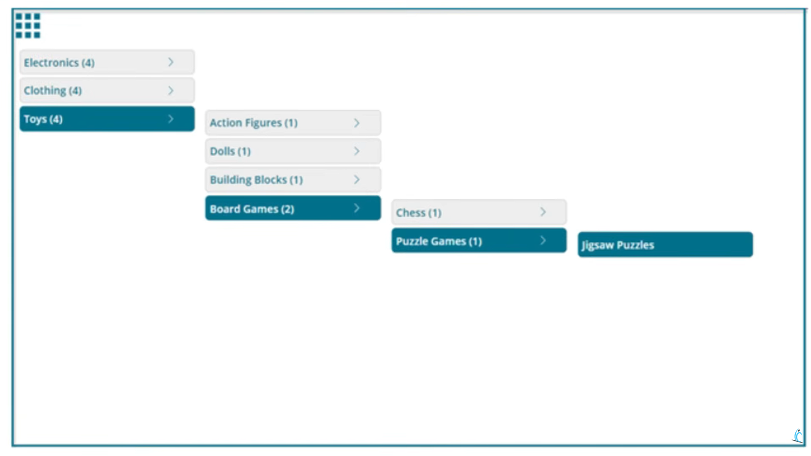 You can watch below video which will guide you to build Hierarchical Menu step by step.
1. What Is a Power Apps Hierarchical Menu?
A multi-level hierarchical menu is a navigation structure that organises content into parent-child relationships across multiple layers. Instead of a flat list of links, users can drill down progressively — clicking a top-level category reveals its subcategories, and those subcategories reveal their own children, and so on.
In Power Apps, building this kind of dynamic, nested navigation is a common requirement for enterprise dashboards, product catalogues, and admin panels. This guide walks you through constructing a four-level hierarchical menu in Power Apps from scratch — a structure you can extend to as many levels as your project needs.
KEY INSIGHT: The four-level hierarchy covers: Top Level → Sub-Level 1 → Sub-Level 2 → Sub-Level 3. The same pattern repeats for every level, making expansion straightforward.
2. Understanding the Data Structure
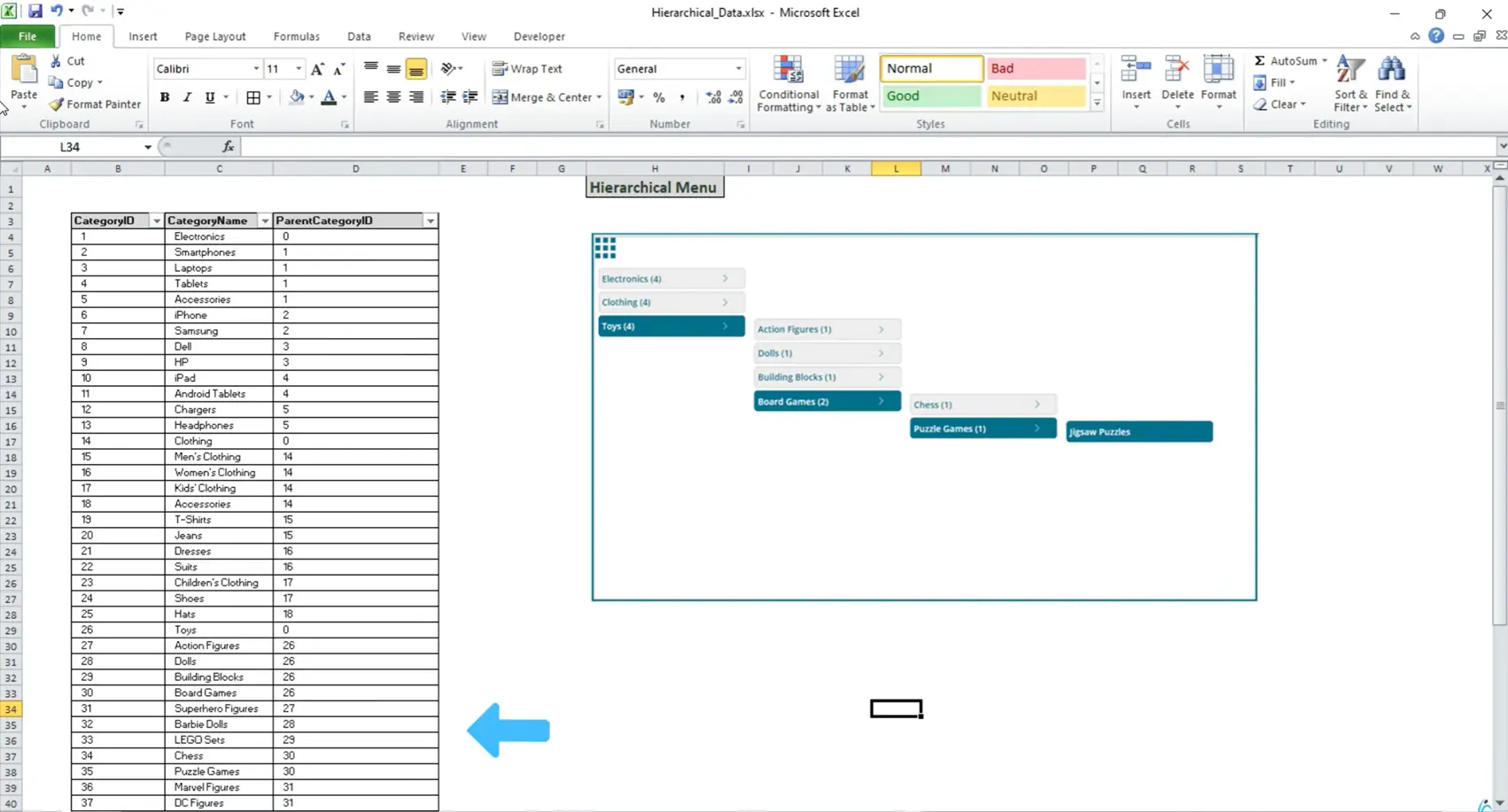
Before writing a single formula, you need to understand the data model that powers the entire menu. The menu relies on a product categories table with exactly three key columns:
| Column | Purpose | Example Value |
|---|---|---|
| CategoryID | Unique identifier for every menu item | 26 |
| CategoryName | Display label shown in the menu | “Toys” |
| ParentCategoryID | Links child to parent; 0 = root level | 0 / 26 / 30 |
The ParentCategoryID column is the heart of the system. When this value equals 0, the item sits at the root level. When it equals the CategoryID of another item, it becomes a child of that item.
A Concrete Example
Consider the “Toys” category, with a CategoryID of 26. Any row whose ParentCategoryID equals 26 — such as Action Figures, Dolls, Building Blocks, and Board Games — automatically becomes a child of Toys. Board Games (ID 30) has children Chess and Puzzle Games at Level 3. Puzzle Games (ID 35) holds Jigsaw Puzzles at Level 4.
| Level | CategoryID | CategoryName | ParentCategoryID |
|---|---|---|---|
| L1 (Root) | 1 | Electronics | 0 |
| L1 (Root) | 2 | Clothing | 0 |
| L1 (Root) | 26 | Toys | 0 |
| L2 | 27 | Action Figures | 26 |
| L2 | 30 | Board Games | 26 |
| L3 | 31 | Chess | 30 |
| L3 | 35 | Puzzle Games | 30 |
| L4 | 36 | Jigsaw Puzzles | 35 |
Additionally, a fourth column — Screen — stores the target screen name, enabling direct navigation when a user clicks a leaf menu item.
3. Setting Up Collections in Power Apps Hierarchical Menu
Navigate to the OnStart property of the App object. This is where you initialise all collections and global variables.
Step 1 — Load the Master Collection
Populate the master ProductCategories collection from your data source (Excel, SharePoint, Dataverse, etc.). All four columns are loaded here.
Step 2 — Build the Root-Level Collection (ColFirst)
Filter the master collection to extract only top-level items (those with ParentCategoryID = 0). At the same time, add a RowNumber column — this is critical for calculating the Y-position of child galleries later.
Power Fx — OnStart
// Clear the existing root collection
Clear(ColFirst);

// Loop through top-level items only
ForAll(
  Filter(ProductCategories, ParentCategoryID = 0),
  Collect(
    ColFirst,
    AddColumns(
      ThisRecord,
      "RowNumber", CountRows(ColFirst) + 1
    )
  )
);
The RowNumber is sequential — 1 for Electronics, 2 for Clothing, 3 for Toys — and enables precise Y-coordinate calculations for each nested gallery.
Step 3 — Define Global Color Variables
Power Fx — Global Colors
Set(
  gAppColors,
  {
    LightColor:  ColorValue("#ECF0F1"),
    MediumColor: ColorValue("#2C3E50"),
    DarkColor:   ColorValue("#1A252F")
  }
);
4. Building the Menu Component in Power Apps Hierarchical Menu
Navigate to Components → New Component and name it MnuHierarchy. Enable Access App Scope so the component can reach the collections and variables defined in OnStart.
CRITICAL: Enabling “Access App Scope” on a component is the single most important toggle — without it, your galleries cannot reach the OnStart collections.
Adding the First Gallery (Gallery 1)
1. Insert a Vertical Gallery
Set its Items to ColFirstHierarchy. Choose Title Only layout and set TemplateSize to 30px with TemplatePadding of 5px.
2. Add a Button Inside the Template
Replace the default title label with a button. Set Width to Gallery1.TemplateWidth, X to 0, BorderRadius to 5, and FontSize to 10.
3. Style Selected vs. Unselected States
Use If(ThisItem.IsSelected, …) on Fill to show gAppColors.MediumColor for selected items and light gray for others.
4. Add a Navigation Arrow Icon
Insert a chevron icon (30×30px) as the drill-down trigger. Set Visible to hide when ChildRecord <= 1 so leaf items show no arrow.
5. Set the Button Text
Set the Text property to ThisItem.CategoryName. This will later be enhanced to concatenate the child count — e.g., “Toys (4)”.
5. Displaying Child Count on Menu Items
To give users instant insight into how many sub-items exist beneath each category, build an enhanced version of the root collection — ColFirstHierarchy — that includes a ChildRecord column.
Power Fx — ColFirstHierarchy
Clear(ColFirstHierarchy);
Collect(
  ColFirstHierarchy,
  AddColumns(
    ColFirst,
    "ChildRecord",
    CountRows(
      Filter(ProductCategories, ParentCategoryID = ThisRecord.CategoryID)
    )
  )
);
Then update the button’s Text property to conditionally show the count:
Power Fx — Button Text
If(
  ThisItem.ChildRecord >= 1,
  Concatenate(ThisItem.CategoryName, " (", Text(ThisItem.ChildRecord), ")"),
  ThisItem.CategoryName
)
6. Adding Subsequent Gallery Levels (L2, L3, L4)
Every subsequent gallery uses exactly the same pattern. Copy Gallery 1, rename it Gallery 2, and make two changes: update the Items data source to ColSecondHierarchy, and update the navigation icon’s OnSelect to populate the next-level collection.
Power Fx — Gallery 1 Arrow OnSelect (populates L2)
Clear(ColSecond);
ForAll(
  Filter(ProductCategories, ParentCategoryID = Gallery1.Selected.CategoryID),
  Collect(
    ColSecond,
    AddColumns(ThisRecord, "RowNumber", CountRows(ColSecond) + 1)
  )
);
// Then build ColSecondHierarchy with ChildRecord column (same pattern)
Repeat this process for Gallery 3 and Gallery 4. At Gallery 4, hide the navigation arrow entirely — there is no fifth level to reveal.
COMPONENT WIDTH: Set the component’s overall Width to App.Width / 1.4 to provide enough horizontal space to display all four side-by-side galleries without clipping.
7. Dynamic Y-Position with Row Numbers
Power Apps has no built-in way to retrieve the pixel position of a selected gallery row. That is precisely why the RowNumber column was introduced. It allows you to calculate the exact Y-coordinate for every child gallery.
Power Fx — Gallery 2 Y Position
Gallery1.Selected.RowNumber
  * Gallery1.TemplateHeight
  + Gallery1.TemplatePadding
  + Gallery1.Y
  - Gallery1.TemplateHeight
Breaking this down: multiply the selected row’s number by the template height to reach that row’s vertical offset, add padding and the gallery’s top position, then subtract one template height to align the child gallery flush with the top of the selected item.
For the X position, each child gallery aligns to the right edge of its parent:
Power Fx — Gallery 2 X Position
Gallery1.X + Gallery1.Width + 5
8. Screen Navigation in Power Apps
When a user clicks a menu item (rather than the drill-down arrow), they should navigate to the corresponding screen. Add this to the OnSelect property of every gallery’s button:
Power Fx — Button OnSelect (navigate)
If(
  !IsBlank(ThisItem.Screen),
  Navigate(ThisItem.Screen)
)
Make sure each leaf-level screen exists in the app. In the tutorial, dedicated screens are created for Electronics, Toys, and Jigsaw Puzzles — each confirmed by a screen-level label — so navigation is visually verifiable.
9. Cleaning Up Collections Between Selections
Without proper cleanup, stale child data from a previous selection lingers when users switch to a different parent. Add cleanup logic to the OnSelect of each gallery’s navigation arrow:
Power Fx — Gallery 1 Arrow OnSelect (cleanup)
Clear(ColThird);
Clear(ColThirdHierarchy);
Clear(ColFourth);
Clear(ColFourthHierarchy);

// Then populate ColSecond and ColSecondHierarchy...
Also add Visible logic to each child gallery so it hides automatically when its collection is empty:
Power Fx — Gallery 2 Visible
CountRows(Gallery2.AllItems) > 0
Show / Hide the Entire Menu
Control the visibility of the entire menu component with a global toggle variable. A hamburger icon in the app header sets showMenu to true or false. Initialise it to false in OnStart so the menu starts hidden.
Conclusion
Building a multi-level hierarchical menu in Power Apps requires three things working in concert: a clean parent-child data model, dynamically filtered collections for each level, and row-number-based Y-positioning that gives child galleries spatial context.
Once the pattern is established for Level 1 → Level 2, it scales cleanly to Level 3, Level 4, and beyond.
Key takeaways: use ParentCategoryID = 0 to isolate root items; always generate a RowNumber column for Y-position math; display ChildRecord counts to guide users; and clean up lower-level collections on every parent selection to prevent stale data leaking through.
